Fed's Hawkish Surprise: Why Rate Cuts Are a Long Shot
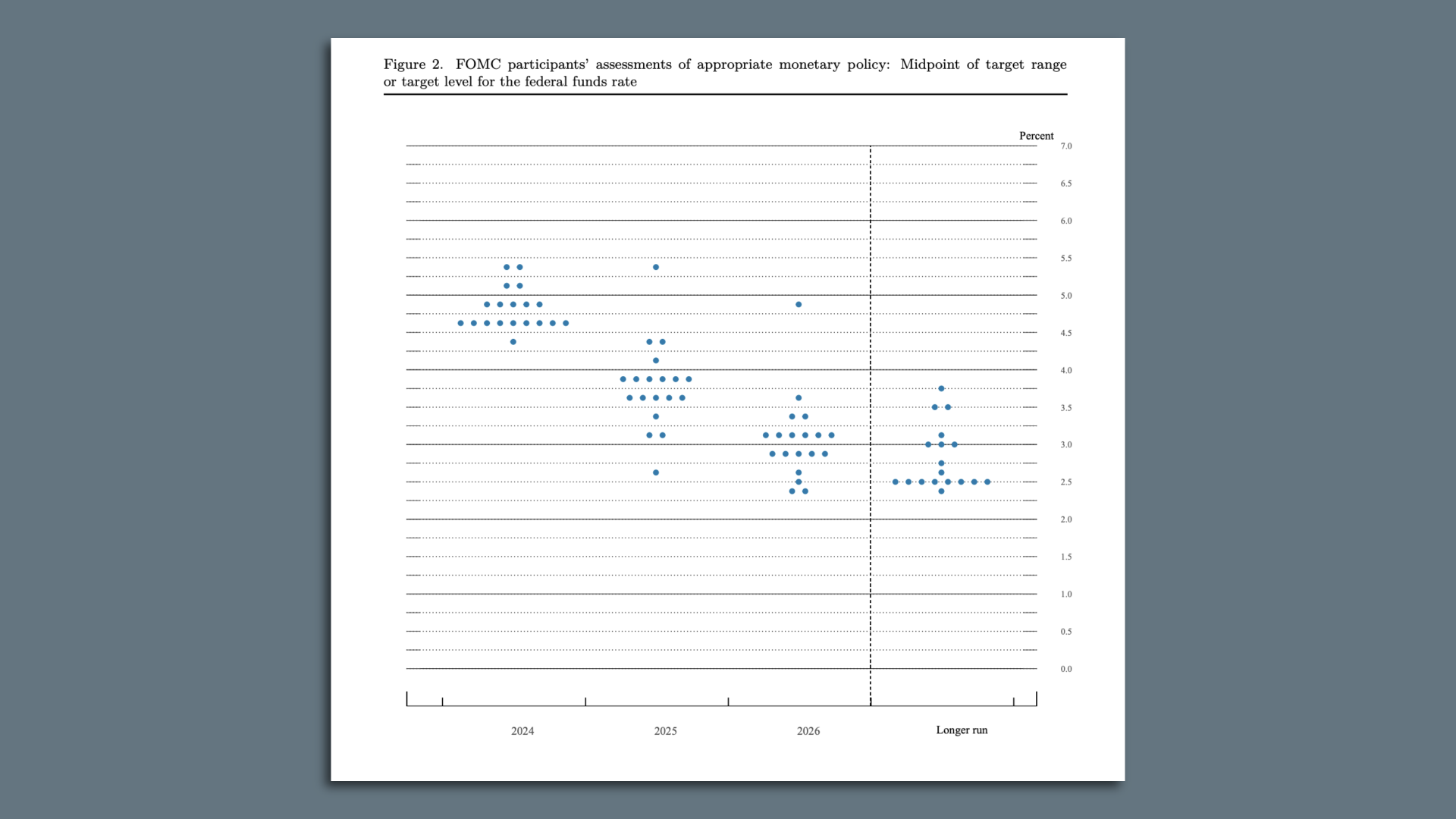
Wednesday afternoon, the fate of global financial markets will hang on an array of dots that give clues into how much rate-cutting the Federal Reserve will deliver this year. But Wall Street may be putting too much weight on the so-called dot plot.
Why it matters: The dots create a lot of market noise, but they contain less true signal about the policy outlook.
State of play: The dot plot, released four times a year, sheds light on how the 19 top policymakers in the Fed system anticipate their interest rate policy evolving in the coming couple of years and in the long run.

- The dots are anonymized, so we don't learn who made which projection. But the dispersion of the forecasts can give a good sense of where consensus lies on the policy-setting Federal Open Market Committee.
- In March, the median official anticipated three interest rate cuts this year. Given elevated inflation readings and solid growth since then, analysts expect the median dot in Wednesday's release to show only two rate cuts.
Yes, but: There is a distinct chance that the recent data flow has pushed officials toward even more monetary hawkishness — which would disappoint markets hungry for rate cuts.
- There are 30% to 40% odds the median dot will show only one rate cut this year, Steve Englander of Standard Chartered Bank estimates, and that result "would be a major hawkish shock," he wrote in a note.
Reality check: That kind of reaction implies that the dot plot is a more precise forecasting tool than it is. A small change in one or two officials' views can shift the median dot — even if those views are held with low conviction or by officials who don't have a policy vote this year.
- The dots are "not a committee decision or plan," as chair Jerome Powell said in March, but rather an indication of the range of views of what is likely to be warranted by economic developments.
- In that sense, the more important question is how wide that range of views turns out to be. In other words, "the distribution of the dots is much more important than the 2024 median dot," as SGH Macro Advisors chief U.S. economist Tim Duy wrote in a note.
Between the lines: The Fed is a consensus-driven organization. It's hard to imagine Powell moving forward with two rate cuts by cobbling together a narrow majority vote if nearly half the committee is dead-set against it.
- In the event of a narrowly divided committee, "the evident lack of consensus among FOMC participants will likely lead to policy inertia," Duy wrote, meaning high rates staying in place longer.
This article originally appeared on Axios